All interior lovers know the importance of colour. It represents so much to us – it influences our emotions, our buying habits and so many of the choices we make. It can transform a room from a dull, dark, atmosphere vacuum, into a space of relaxation and tranquillity, a bright, warm family space, or a passionate creativity centre.
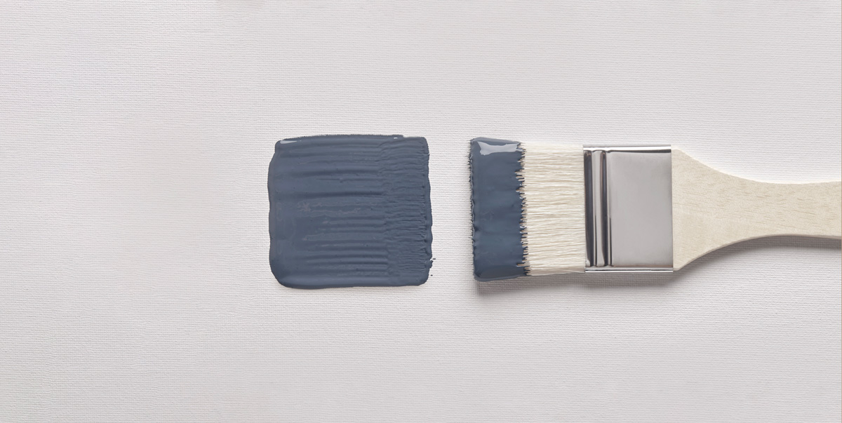
We all want to feel relaxed, happy, and safe in our surroundings, and colour plays a huge part in this. This is why choosing the right colour for a room in your house is an incredibly important part of the decorating process. With the help of colour experts and Cox & Cox’s own in-house design team, we’ve put together a paint colour guide – offering top tips on what colours work well in each room in your house, as well as what will work for you and your taste.

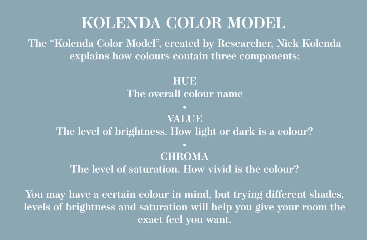
How does colour affect your mood?
Knowing what mood you want to convey in your individual rooms is so important. Mark Shaw, Lecturer at London College of Contemporary Arts (LCCA), said:
“Colour has the potential to affect us in a multitude of ways – it is both objective and subjective. Colour may be used to induce feelings of comfort, relaxation and harmony or vigour, vim and vitality. How we perceive colour is contingent upon many factors including human physiology, psychology, culture, history, social conventions and personal preferences.”
So, although you might interpret colour slightly differently to the person standing next to you, based on past experiences, associations and preferences; there are some key traits associated with colours that prove true for the majority of people.
For example, a study by Lauren Isabelle from the University of Massachusetts showed that different colours evoke different emotions in people:
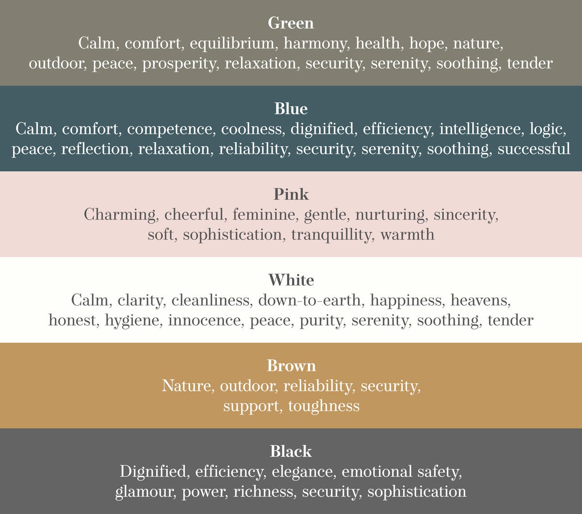
As you can see, the same colour can evoke contrasting emotions, there is so much more to colour that just what we see at first glance. Although personal preference plays a huge part in interior design, there are some rules designers stick to – the calm and comforting tones of green and blue are popular for bedrooms where red is a no go (red is considered a passionate colour, but we don’t want to feel angry or anxious when going to sleep), brown doesn’t typically work on living room walls (it can look drab, and make a small room look smaller), and neon colours are best avoided in kitchens.
Consider how natural light affects paint colours
It’s so important to understand how light falls in a room to ensure that you get the perfect look and feel from your paint choice. A general rule is that if your room is north facing it will let in soft light, producing a warm effect. This means dark paints will look darker and light paints will be dimmer.
If the room is south facing, it will have much more intense light. Dark colours will appear brighter and light colours can make the room look washed out. Rooms on the west side of your home will receive warm light in the evenings and shadows in the mornings, and rooms with exposure from the east can brighten up your room before noon and make it cooler in the evenings.
You can also use artificial lighting to alter the colour of your rooms, no matter what time of day it is, and regardless of natural light. Go for standard soft white LED lights to provide natural lighting, leading to bright colours becoming more intense and cooler tones a little more subdued. Fluorescent lights give off a blue, cooler light, and pairs well with cooler paints.
Which colour is best for which room?
Dani Taylor, Buying Director at Cox & Cox, has offered her advice on which colours work well in different rooms in the home, keeping in mind the feelings each room will evoke and the oncoming trends.
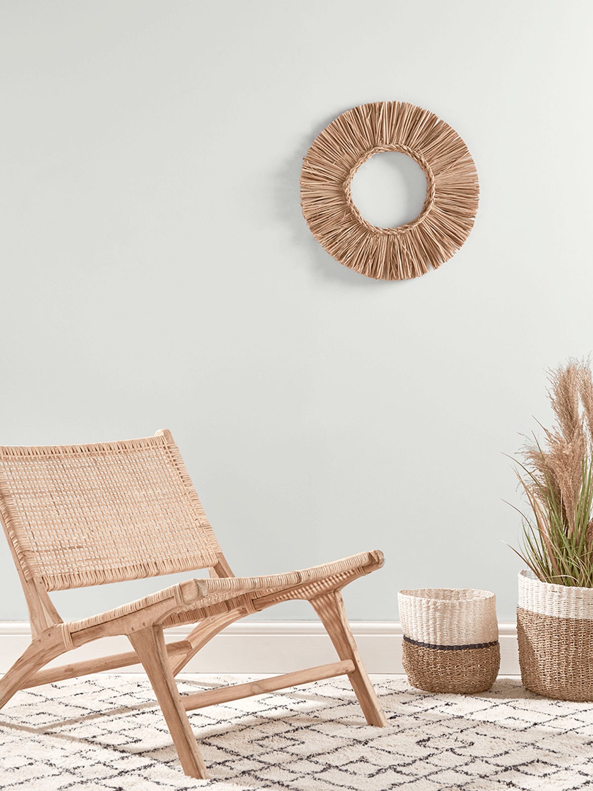
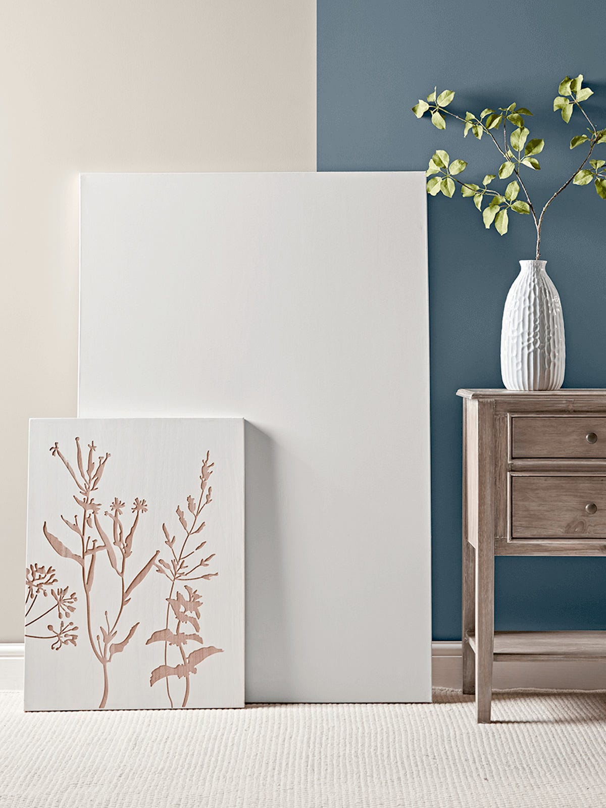
Bedroom The soft heritage of Wick White is the perfect shade for a bedroom, promoting calm, peace and serenity. A slightly off-white is key to creating a tranquil oasis for you to relax in and stops the harsh glare that pure brilliant white can give off, creating a calm oasis for you to relax and drift off for a comfortable night’s sleep. If you prefer a hint of colour, a gentle coloured tone like Smock is a great alternative. Smock is a refined shade of pink, with a slightly earthy tone, it's sophisticated and versatile.
Kitchen Pale greys and mid to dark toned blues work well in the kitchen, keeping the space looking fresh and clean. If you have bold coloured kitchen units, a more neutral backdrop of Flaxen or Lansdown lets the units make the statement.
Bathroom When it comes to bathrooms, white never goes out of style. However, on its own, it can help to highlight some of the more unseemly features of a bathroom, especially when teamed with bright lights. Pairing your walls with a darker shade with character such as Souris might deliver a more contemporary feel to your space.
Living Room The living room is a great room to experiment with deeper hues. A deep blue hue like Hainsworth and a darker green like Bay work well as they promote comfort and relaxation – cocooning you within the room, and can be dressed beautifully with neutral accessories. Nocturne blue walls look fabulous with brass light fittings and a statement mirror.
Home office For many, home or hybrid working has become a normal part of our lives. So, it is more important than ever for us to try to keep some boundaries between our home and work life. For those of us lucky enough to have a dedicated room or nook to work in, keeping colours that reference nature close to us is vital. A pale shade such as Gesso can create a soothing and calming space - especially when layered with real and faux plants to bring more of the outside in, and small sections of colour can help to zone a section of a room dedicated to working in.
The importance of choosing the right colour
“Feeling comfortable, creative and relaxed in the living areas of your home is essential.” – Dani Taylor , Buying Director
With her years of interior expertise, Dani knows the importance of picking the right colours when decorating. She said: “I always start with one thing in the room that I love, and try to build around that, whether it be a favourite armchair, or a fabulous light fitting, or even an existing feature like a fireplace or large window. And I don't always choose a light colour for a small space, sometimes you just need a little drama in the downstairs loo – and painting it khaki or deepest grey can add excitement without compromising a main living space.”
“In many cases, the colour of your room can make the difference between a standard, dull space, and a room that represents your style, personality and taste. It can also be a deciding factor in how much you use it – feeling comfortable, creative & relaxed in the living areas of your home is essential.”